Global Vision, Refined Look: EquitiesFirst’s Brand Transformation
The Challenge
EquitiesFirst faces a trust deficit in the market, with scepticism around its non-traditional financing model. Limited awareness and misconceptions have hindered its credibility. The challenge is to reposition EquitiesFirst as a transparent, innovative, and reliable capital partner on the global stage.
The Solution
Through in-depth interviews with key stakeholders and clients, we uncovered insights that aligned business objectives with brand perception. Building on EquitiesFirst’s heritage, we retained core brand equity while identifying opportunities for evolution. These insights shaped a refreshed brand strategy that positions the firm as a trusted capital partner, and established a clear foundation for messaging across 12 global markets.
Design & Creative Direction
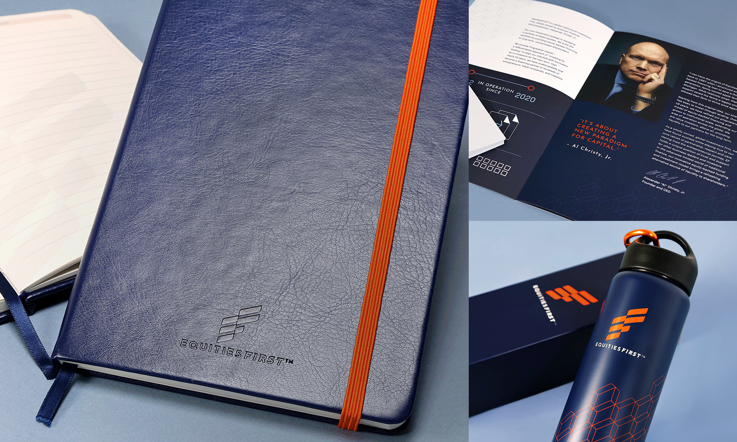
Designed a modern brand identity and refined logo to reflect professionalism, partnership, and progressive values.
Developed a consistent global brand system anchored in Orchard Orange and Sincere Blue to enhance recognition and cohesion.
Rolled out the refreshed identity across digital, print, and premium touchpoints, reinforcing credibility and delivering a polished brand experience across all markets.
Role: Brand Strategy, Creative & Art Direction, Brand Identity Design
Awards
Dragons of Asia 2021, Black Dragons - Best Brand Building and/or Awareness Campaign
Dragons of Asia 2021, GOLD - Best Integrated Marketing Campaign
In2 SABRE Awards 2021, Branding and Identity
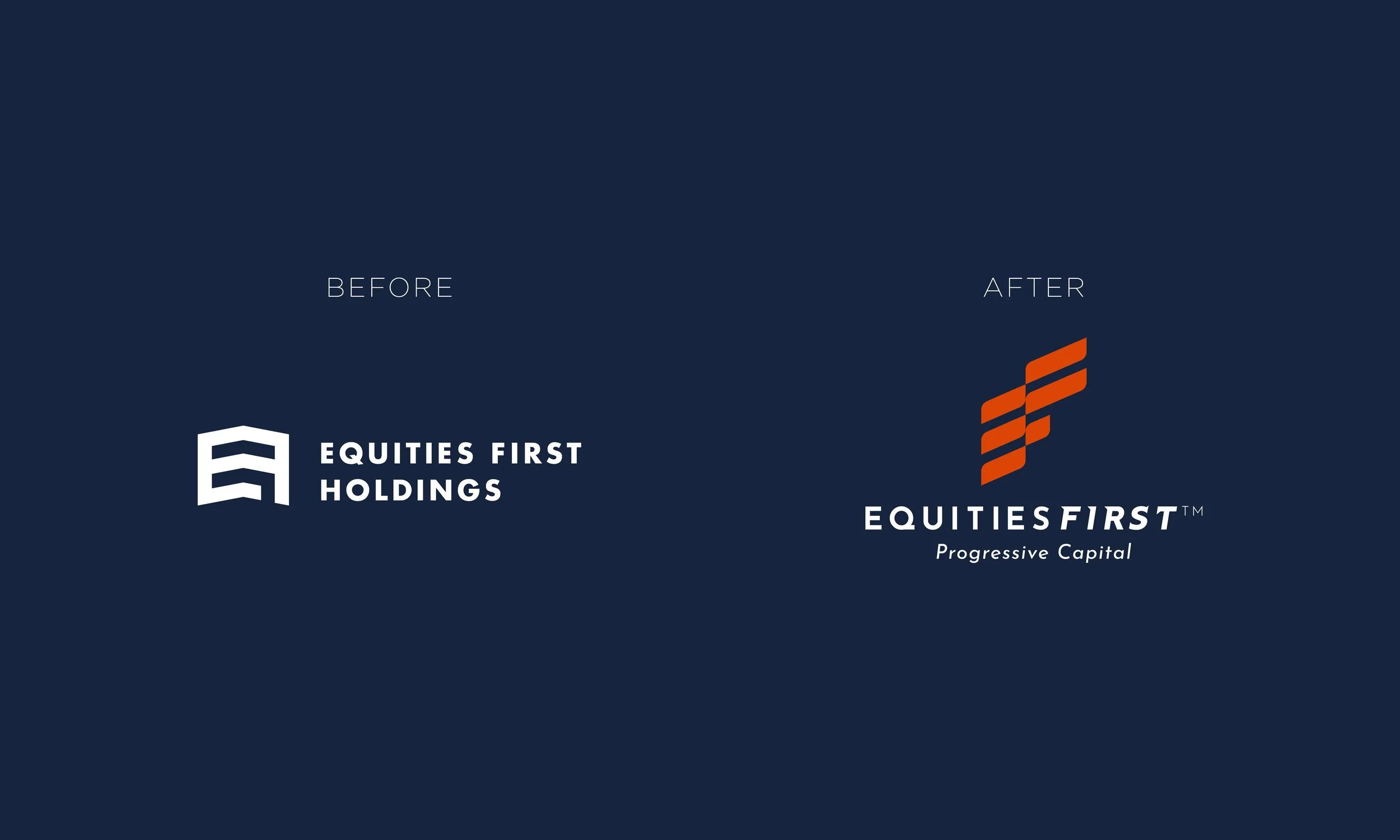


“Orchard Orange conveys energy and innovation, while Sincere Blue reinforces trust and security—together, they form a balanced, expressive foundation for the brand’s visual identity.”