Reviving a Legacy: Bupa’s Strategic Win with Quality Healthcare
The Challenge
Quality HealthCare (QHMS), Bupa’s Hong Kong network, needed a refreshed identity to reflect its innovation and leadership. Though known for excellent care, its outdated branding no longer aligned with its heritage or Bupa’s global image
The Solution
I led the rebrand with empathy and precision—using research and workshops to uncover QHMS’s strengths. Trust, innovation, and human warmth shaped a new identity that bridges Bupa’s global presence with local roots and belief.
Design & Art Direction
The refreshed visual identity strikes a balance between clinical professionalism and human approachability.
Logo: Featuring clean, rounded forms to express care and clarity, adaptable across all formats.
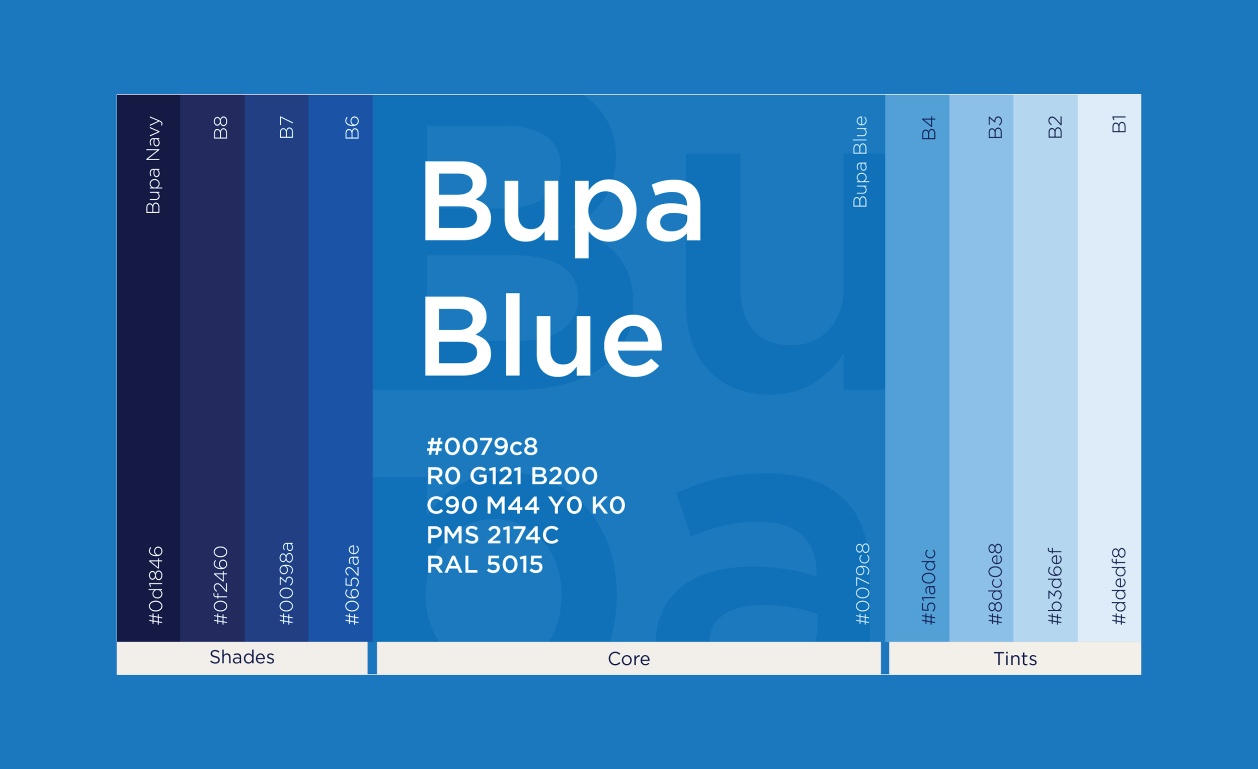
Colours: Bupa’s signature blue remains central, complemented by a refined palette of blues and neutrals to evoke calm and reassurance.
Typeface: Modern sans-serif typography adds clarity with subtle warmth, enhancing readability across mediums.
Photography: Focuses on candid, authentic moments of care—reflecting real connections, not staged interactions.
Layouts and icons: Streamlined for clarity and accessibility across clinics, digital and print.
Role: Creative Strategy, Creative & Art Direction, Brand Identity Design
The Result
The refreshed brand identity helped reposition Quality HealthCare as a modern, trusted healthcare provider—rooted in its heritage but built for the future. Visually coherent and emotionally resonant, the new design system elevated the patient experience and reinforced QHMS’s position as a leader in Hong Kong’s healthcare space.


Brand Guidebook
Website

Digital Posters
“Branding as preventive care: We gave Bupa’s Quality Healthcare an identity so intuitively welcoming, it reduced first-time patient anxiety before they even walked in”


